 NEW YORK | In the 2012 US presidential campaign, economic inequality is taking center stage. For both Barack Obama and his Republican opponents this issue offers defining opportunities as well as risks. The White House believes the core of the debate should be the 1-percent-versus-99 percent-issue, as the Occupy Wall Street movement put it, and points out that cutting taxes on the wealthy “doesn’t work.” Besides, Mr Obama has called for legislation that would create stronger fines for financial companies that repeatedly commit fraud.
However, Republicans would rather argue about debts and deficits. GOP candidates focus on personal responsibility instead of inequality itself and insist that the main problem is president Obama’s failing to rebuild the economy, blaming him for America’s 8 percent unemployment rate.
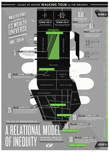
By now, our readers will certainly have read so many special issues of economic downturn, such as OECD’s report Divided We Stand: Why Inequality Keeps Rising (download pdf here). But we wanted to offer them a 2.0 take. Today we bring you designer Kelli Anderson’s approach. This lady from Brooklyn takes us for a walk through inequality in an unexpected way: she has transposed income inequalities on an interactive map, using Wall Street Journal data onto the geography of New York City itself.
In an email sent to weekly newsletter Brain Pickings, Anderson explains her view:
“The scale of the solar system (which is reigned-in by the gravity of the sun) is far less dispersed than the the scales of wealth in the US—which illuminates the propensity for wealth to skew wildly to the top when the financial system is not effectively regulated. Note that almost everyone in the top 1% works in banking or finance. Also note that the income discrepancy within the levels of the top 1% are vastly greater than the gap between the top 1% and the bottom 1% of income earners. The proportions of wealth in the upper echelons of income are of a scale to which we have no comparable metaphors— the proportions are far beyond what we can see in the physical reality of our solar system.”
Inequality, you can see it just going for a virtual walk, is there. But do Americans care about it? According to a Gallup poll, they are less concerned about inequality now than they were in 1998. According to a recent poll, 52% of Americans say the rich-poor gap is “an acceptable part of our economic system.” A slightly lower 45% said the gap “needs to be fixed.”


Be the first to comment on "Inequality map"