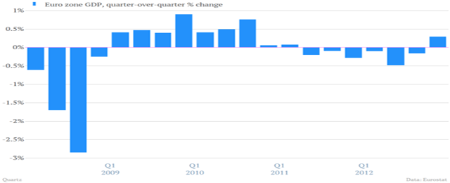
We knew the numbers: the euro zone has finally emerged from recession, Spain’s trade deficit has virtually disappeared, in the UK unemployment is slowly falling, … but isn’t it nice to actually see it?
Here you are Spain’s unemployment, still huge, although apparently not out of control anymore. The chart shows it has topped out.

The UK, Spain and Italy’s borrowing costs have considerably lowered.

And Japan, the third-largest economy, is little by little overcoming deflation, which has hit them since the 1990s.

*Check out the rest of the charts in the original piece here.


Be the first to comment on "The Recovery Charts That Made Our Day"