The Recovery Charts That Made Our Day
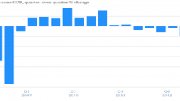
THE CORNER TEAM | Because an image is worth more than 1,000 words, we are reposting here a fantastic idea by Quartz: they’ve put together 19 graphs of the global economic recovery, from the adjustments that the most crippled euro zone countries are making to Japan leaving deflation behind. Chill out, things are getting better… and it’s Friday.


